UberAir
UI/UX Design
8 Weeks
Applied 2020 Bootcamp
Uber Air is an ambitious vision for the future of a multi-modal ride-sharing journey where riders would be able to have share flights at the tap of a button to alleviate congestion on the ground. My challenge was to create an end to end mobile booking experience for this process that could live within the Uber App and follow the Uber design guidelines.

Problem
Large amounts of time are spent and lost to commuting and travel for businesses who send their employees to client meetings.
l
How might we create an end to end mobile booking experience for Uber Air that would encourage the use of multi-modal transportation?


1. Discovering a Ride
Mike enters the destination of his client meeting and is prompted with a recommended screen. He is also able to swipe up to check other ground and air transportation options to fit his needs.

2. UberAir's First Time User Onboarding
Since Mike is a first time user, he is prompted with a first-time user journey explaining what UberAir is and how it might be the best ride option for his needs.

3. Find Your Best Flight
With so many ride options, Mike is able to narrow down his search with a new sort function. This creates tailored search results based on what his priorities are.

4. Beyond the Flight
After selecting UberAir as a ride option, Mike is able to add additional legs to his journey to create a seamless ride experience from his current location to the Skyport, and from the Skyport to his final destination.

5. Keeping On Schedule
After purchasing his trip, Mike has centralized control and is able to see his UberX pickup information, itinerary preview, and his current and next steps. The micro-interactions with the active and inactive states provide a second layer of reassurance for Mike, indicating which step he's on and what to anticipate next.
After each step of his jouney is completed, mobile notifications continually prompt Mike to easily re-enter the app.
Process

Research
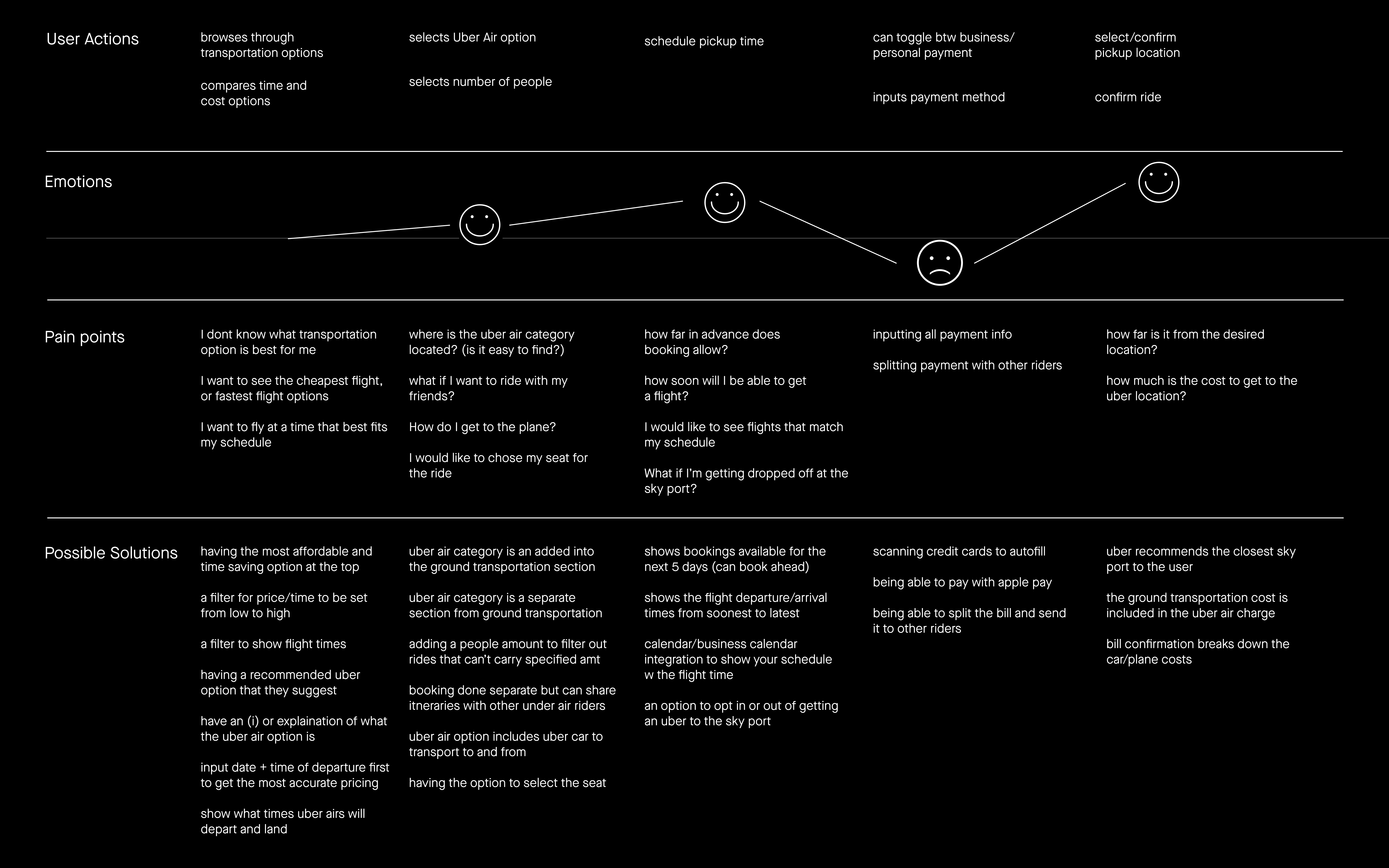
User Journey
(slide 1)
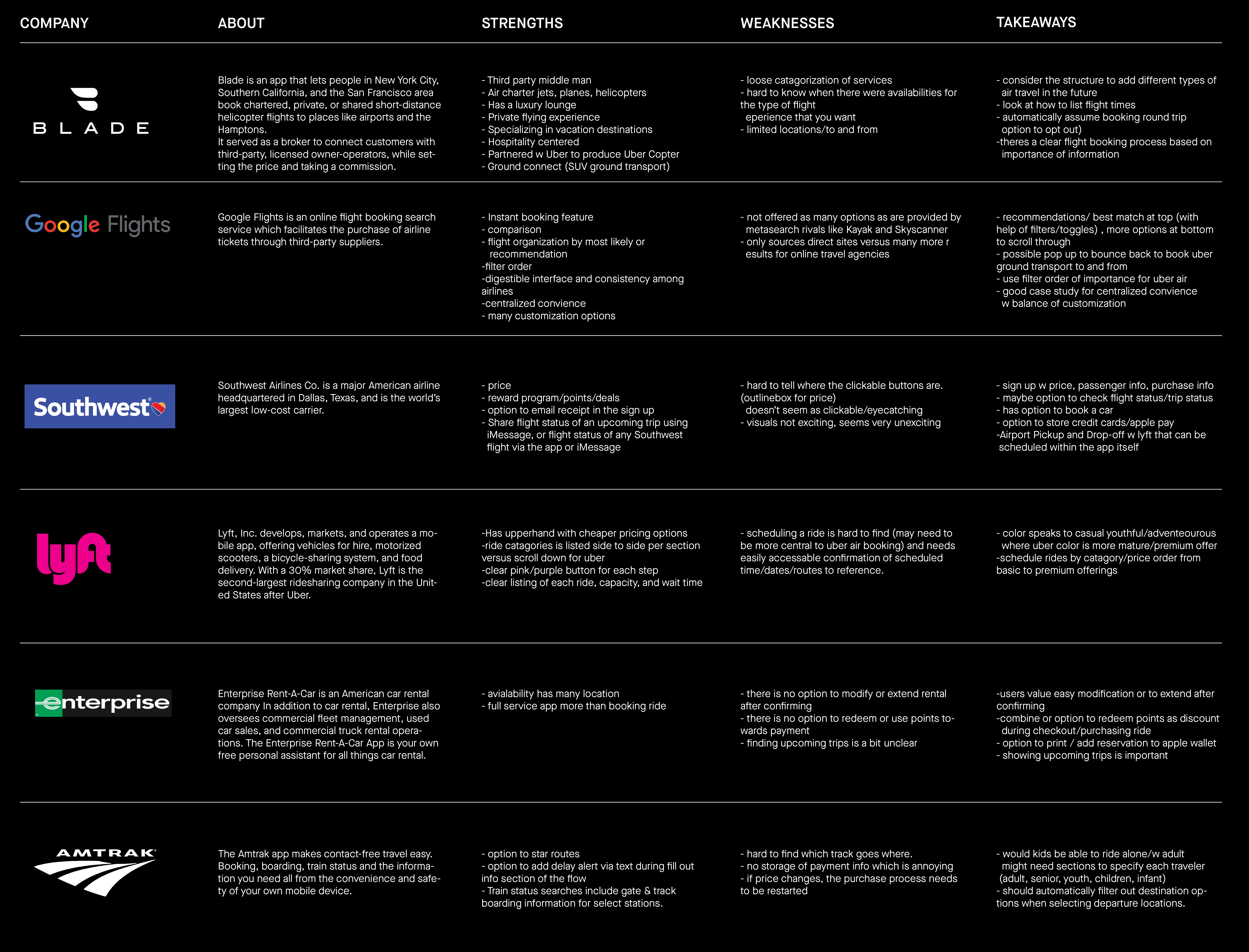
Competitor Analysis
(slide 2)


User Flow

Wireframes (click to pause and play)

User Testing
I conducted user testing on a group of 6 working professionals who had varying usage of rideshare apps. My goal was to understand what the hierarchy of information is and which layouts would be most effective for the users to quickly understand all the information on each page.
Key Takeaways
ride option listings
transportation preview
uberX pickup + itinerary preview


Separate Ground and Air Listings
All users preferred separation of the ground and air ride options to eliminate excess information and minimize booking the wrong type of transportation.
List Format for Ride Options
All users agreed that Uber's current list layout and format is the most efficient for information comparison and provides the most clarity.
Centralized Control
On a multi-legged trip, users preferred seeing UberX Pickup information while having the itinerary steps listed, providing a layer of confirmation and assurance, especially for those who are first time users.


Final Flowchart

Next Steps
To further improve my project, my next steps would be to do an additional round of user testing in order to make adjustments based on the findings. Then I would continue to build out other business specific features to further caters UberAir towards company use.